
About-Ultra
ABOUT
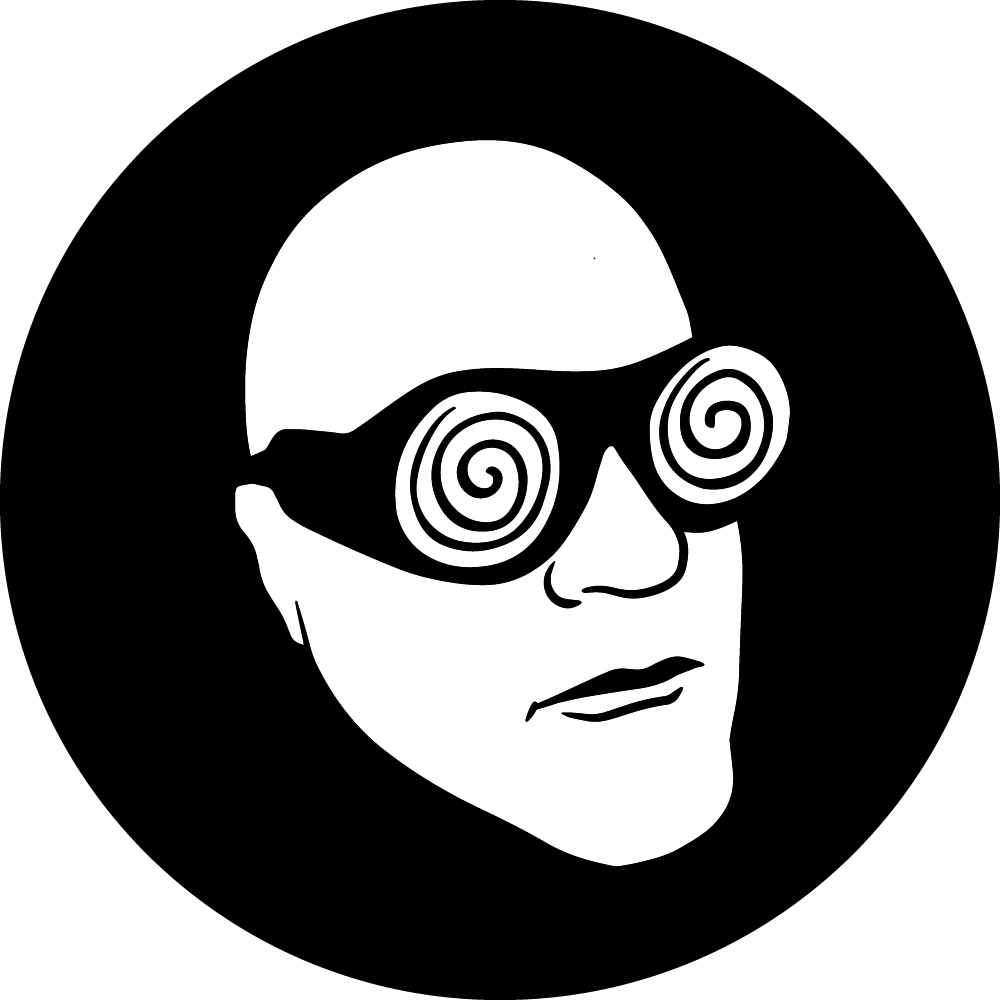
When I start working on a new project, I only know that I want it to feel like for the most part. If I start looking beyond that point, thinking too much about the details, I know that I am going to run into trouble. Instead, I let the project speak to me. In The Sorrow, for example, I have tried to let the style of the sunglasses carve its shape and meaning out for me, playing off of the emotions that I have experienced and the tone that I knew I wanted to strike.
Of course, there is another side to this: to get the details right, I need to put words and meaning to everyone sooner or later. In my tarot deck, I wanted everything to make sense. I wanted the images and the text to flow together, which took a great deal of effort. These are only two examples – and my way of explaining to you why I would find it necessary to create type fonts that are uniquely my own.
In short, the details matter. I create fonts for my work because if I simply go with fonts that are already available, I am not going to get exactly what I am looking for. To get exactly what I am looking for, I need to think outside the fonts that are available. I need to create, just as I create all of the art for my products, just as I create the concepts for my products.
Creating Woody Ultra, I focused on developing a font that was as out-there and wild as so much of my work is. I wanted a font that I could go back to again and again, one that was abstract enough to apply to many of my ideas but also practical enough that people could read it easily and without much effort.
Now that I have gotten Woody Ultra where I want it to be, I am proud to share it with you. This is the font for everything Woody, the font that captures me and who I am in a nutshell.